Two products redesigned from one system.
The problem
SponsorPulse's existing reporting confused users. A new platform (Pulse) was being scoped from a single SME's domain knowledge with no user validation — a recipe for building the wrong thing with confidence.
What I owned
- →Product definition and requirements for the Pulse platform.
- →30+ user interviews and 10 usability tests to validate real user needs before any design was committed.
- →Modular reporting system design — components reusable across both SponsorPulse and Pulse.
- →Design system governance and documentation enabling independent reuse across products.
Key decisions
Research first — before any design committed
Ran 30+ interviews before touching the design instead of copying SponsorPulse's existing (broken) patterns into the new product. This prevented an estimated 3–6 months of building unvalidated features.
Build modular, not one-off
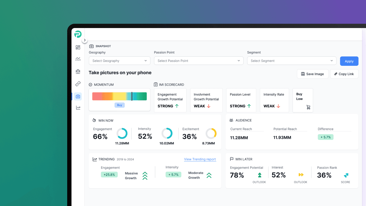
Built reusable report components rather than one-off screens for Pulse. When the roadmap shifted and Pulse's timeline slipped, the same system scaled directly into SponsorPulse and resolved its existing reporting confusion — two products fixed from one system.
Where the SME's instincts were right — and where they weren't
- ✓Users needed transparency into data methodology ("How was this collected?")
- ✓Terminology was confusing — platform-specific jargon didn't match industry language
- ✓Users wanted to export and reformat data for their own presentations
- ✓Different user types (brand marketers, agencies, rights holders) had genuinely different goals
- →Onboarding and contextual guidance — the SME assumed expertise users didn't have
- →Saved reports and organization for recurring workflows
- →Clear differentiation between report types (users couldn't tell "Compare" from "Analyze")
- →Descriptions above charts explaining what the data actually meant
- ×The originally proposed dashboard design — users bypassed it entirely, no real value beyond shortcuts
- ×Feature priorities — usability testing showed a different hierarchy than assumed
- ×Assumed workflows didn't match how users actually worked
“I never really understood the difference between Compare and Analyze. They look the same. I click around until I figure out which one to use.”
“What questions are you asking to get this data point? When I present, I have to show how it was collected.”
Pulse never launched externally — the company decided to keep it as an internal product. The reporting system we'd designed scaled directly into SponsorPulse and fixed a problem that had existed for years. The work shipped, just not in the direction we'd planned.
Outcome
- →Reporting framework live in SponsorPulse, reused internally.
- →Prevented an estimated 3–6 months of building unvalidated features for Pulse.
- →Reduced CX inquiries via in-product onboarding and contextual descriptions added to the reporting system.