Overview
Kajabi's website builder was a critical feature for creators launching their online businesses, but adoption lagged behind other products like Courses and Coaching. Usability issues and a confusing theme system created friction at the most important moment: setting up their brand presence.
As a Design-Led Product Manager, I identified and fixed the biggest UX friction points in the website builder during a broader codebase migration, with a focus on reducing friction, improving clarity, and making the product easier to use.
Platform
Responsive web app
My role
Design-led Product Manager
Team
Engineering Manager, Product Designer, Engineering team
Timeline
3 months
Problem
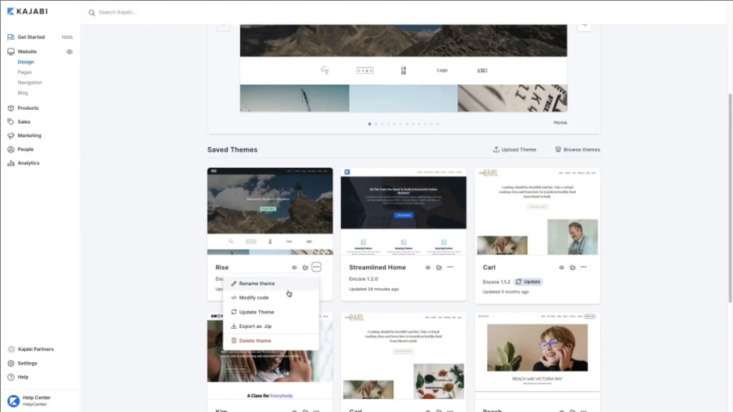
Kajabi's theme update feature had a 0.06% adoption rate. Not 6%. Point zero six percent.
This wasn't because creators didn't want better themes. It was because the workflow was a nightmare. Theme updates were buried 4+ clicks deep, offered zero visual preview, and provided no feedback about what would happen to existing content.
When we talked to creators, they used words like "terrified" and "afraid I'll break everything." They'd start the process, panic halfway through, and abandon it.
Meanwhile, 12% of all support tickets were theme-related questions. Our creators were stuck with default themes not by choice, but by fear.
Constraints
- Codebase migration already underway, fixed timeline and scope
- Couldn't rebuild the entire website builder (engineering capacity)
- Had to work within existing theme infrastructure
- Support ticket volume was 12% theme-related (unsustainable)
- 0.06% adoption rate confirmed broken UX, not lack of demand
The opportunity
On a broader codebase migration, I saw a chance to fix this. Instead of just moving code, we could fundamentally reimagine how creators interact with themes.
The question was: what if updating your theme was as simple as clicking a button?
What I owned
- Product strategy and prioritization: theme adoption, usability, and clarity
- Customer research (interviews, support ticket analysis) and UX audit
- Cross-functional collaboration across design, engineering, and CX analytics within migration constraints
- Scoping improvements to fit within the codebase migration timeline
- KPI definition and tracking: established theme adoption as a core product metric for the first time
Product strategy and execution
I combined customer interviews, support ticket analysis, and a UX audit to pinpoint the main friction: a buried 4+ click flow with no feedback, which left creators afraid they would break their site.
Working within the constraints of a codebase migration, I collaborated with engineering to identify which UX improvements could be implemented alongside the technical work, without extending the timeline. The question wasn't "what should we fix?" It was "what can we fix right now that will move the metric the most?"
Key decisions
One-click theme update
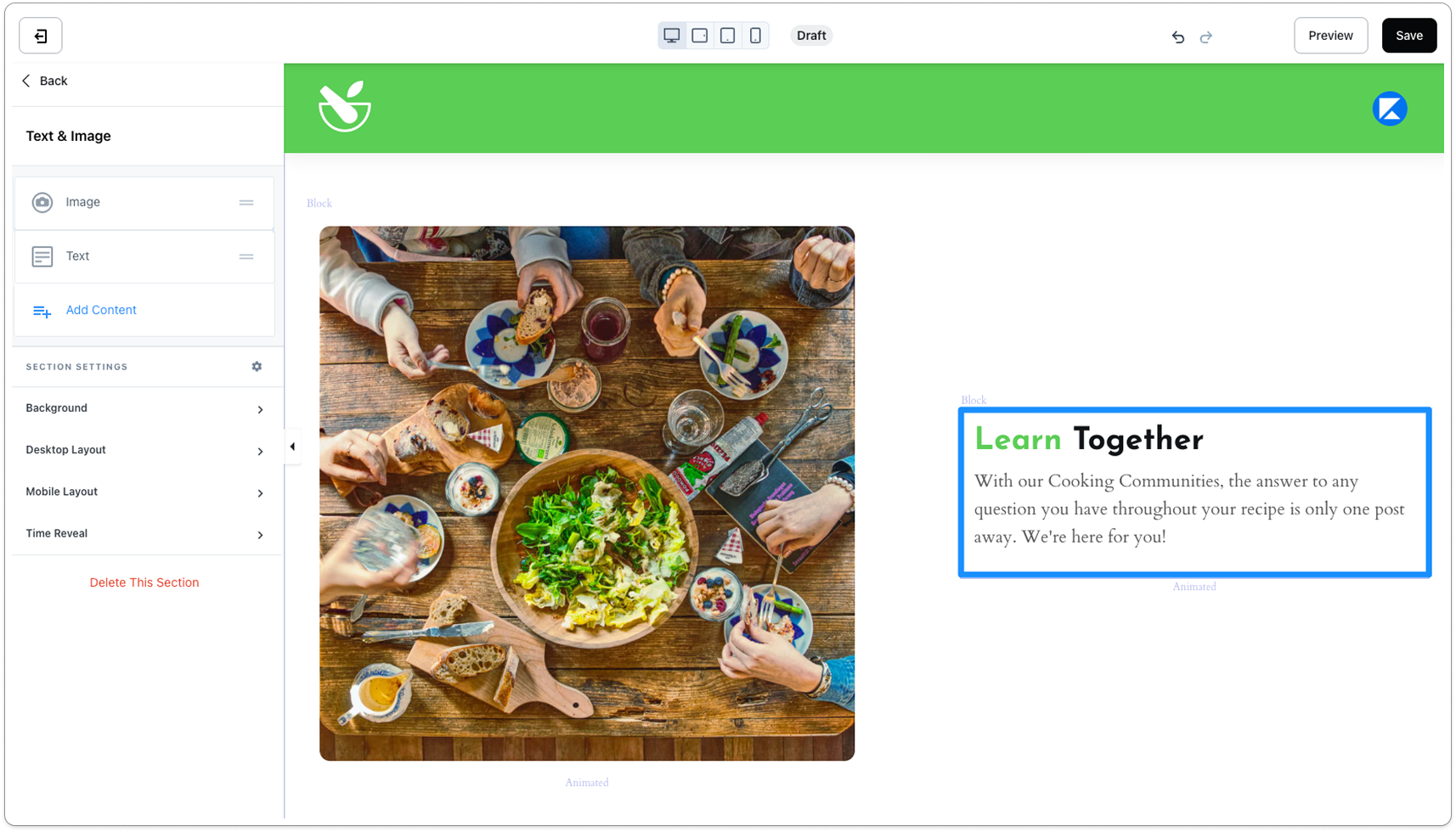
Replaced the buried update flow with a single 'Apply Theme' action surfaced directly in context. Added confirmation modals and visual feedback to reduce uncertainty. Created default styled pages for essential functions (404, login, forgot password) so switching themes felt clean instead of scary.
Simplified fallback pages
Introduced automated fallbacks for system pages (login, forgot password) so creators wouldn't have to manually handle edge cases after switching themes. This removed one of the biggest sources of post-switch anxiety.
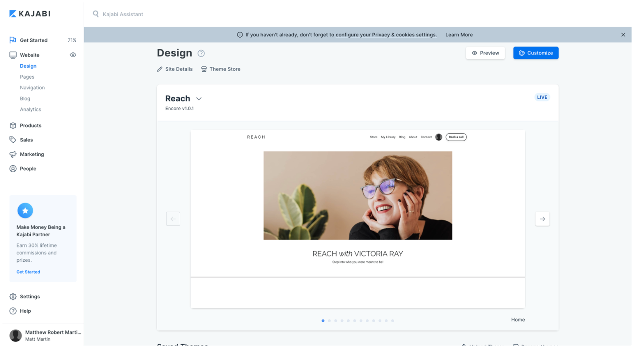
Visual preview of themes
Enabled theme previews before applying. The goal was simple: let creators see the outcome before committing to it. Improved discoverability of Ensemble 2.X updates through carousels and Labs announcements.
Scoped to migration timeline
Postponed broader builder improvements to stay within the migration timeline and focus on the highest-friction moment (theme selection and application). Collaborated with engineering to identify which UX work could ship alongside the codebase migration without extending the timeline.
Outcomes
The one-click theme update feature delivered immediate impact within 30 days of the May 2023 launch:
164% theme adoption in 30 days after launch
21% increase in active website usage (3.4% → 4.2% weekly), indicating creators were more engaged with the builder
Reduced support burden through automated fallback themes, contributing to the team's goal of offloading technical questions from the CX team
More creators now complete website setup earlier in their onboarding funnel
Established theme adoption tracking as a new core product KPI
What this shows
This project showed how targeted UX changes at a single high-friction point can produce outsized results. By fixing a specific 4-step flow instead of overhauling the entire builder, we saw 164% increase in theme upgrades and 21% increase in active website usage.
It also sharpened how I work across design, engineering, CX, and product analytics to ship clean, measurable improvements.